
Icons: A Language Beyond Words

Introduction — Why Icons Matter
Before we read, we see.
Before we understand language, we understand signs.
Icons are one of the most fundamental tools of communication. They bypass grammar, syntax, and literacy, speaking directly through form and recognition. In design, icons quietly do the heavy lifting guiding, simplifying, and inviting users to engage without overwhelming them with text.
At Avaastha, icons are not decorative elements. They are communicators. They help us reduce content, remove friction, and make ideas feel instantly approachable whether it’s a website, a pitch deck, or a poster.
A Brief History — Icons as Human Instinct
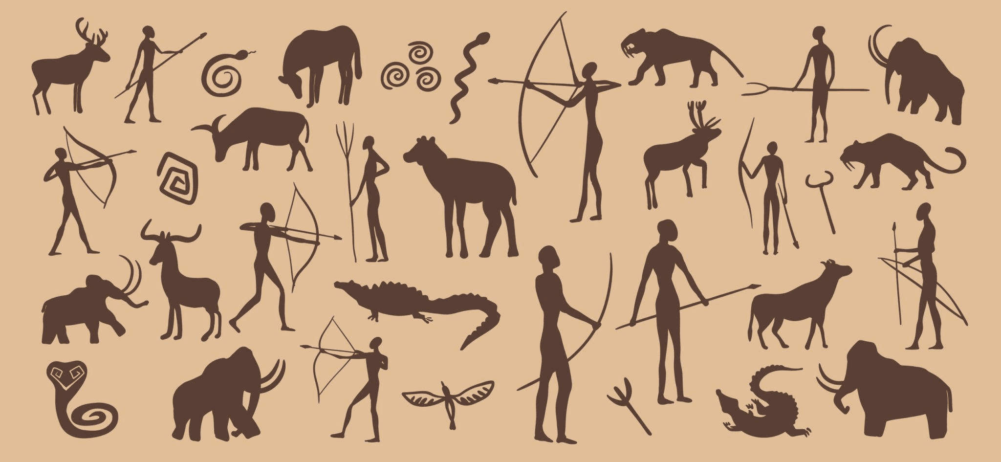
Long before written language, humans relied on symbols.
Cave paintings were early icons stories told through simplified visuals.
Ancient civilizations used pictographs to represent ideas, actions, and objects.
Road signs, religious symbols, and wayfinding systems evolved as universal markers of meaning.
Icons emerged not as design trends, but as human instinct. They exist because humans naturally look for patterns and visual shortcuts to understanding. Even today, a restroom sign, a power symbol, or a warning icon works across cultures without explanation.
This universality is what makes icons timeless and indispensable.
Icons in Modern Design — Reducing Friction
In contemporary design, attention is scarce. Content overload is real.
Icons help us:
Break language barriers
Reduce cognitive load
Make interfaces faster to scan
Encourage users to continue reading
When paired with text, icons act as anchors. When used independently, they become signposts. In both cases, they make information feel lighter and more inviting.
We’ve consistently seen that people engage more when content is visually structured—icons create rhythm, hierarchy, and breathing space.
Avaastha — Direction Before Language
The idea of icons is deeply tied to the idea of direction.
This is where the name Avaastha comes in.
Avaastha refers to a group of constellation. Long before maps, GPS, or written instructions, early travellers looked up. Stars were not decoration in the sky; they were tools. They offered orientation, reassurance, and direction in moments of uncertainty.
A constellation was never a single star it was meaning created through connection.
That idea resonates strongly with how we see design.

From Stars to Signs
Stars guided travellers not by explanation, but by recognition.
You didn’t need to name them. You only needed to understand their position.
Icons work the same way.
They don’t explain.
They orient.
At Avaastha, we see design as a way of helping people find their way through interfaces, ideas, systems, and narratives. Just like constellations, icons become meaningful when they are placed with intent and clarity.
Design as Navigation
In a world overloaded with information, people don’t need more content.
They need clearer paths.
Icons, symbols, and visual systems act as modern constellations quietly guiding users, readers, and audiences without demanding effort.
This is why icons sit at the heart of how we design.
And this is why Avaastha exists.
To give direction before words are even read.
**Visual references inspired by prehistoric symbolic systems and celestial navigation practices.
date published
Feb 6, 2026
reading time
5 min
.see also